Give usability and readability room
Tips for online PDF documents

Bert Wolters
Senior Project Manager
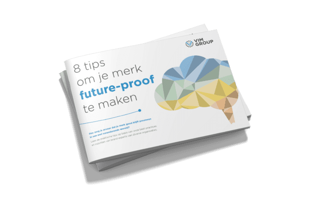
There are no doubt good reasons why books, magazines and other reading matter are portrait-oriented and screens are landscape. Scientists will certainly have solid explanations for that, but that is not my point here. What I do not think there is any good reason for is the portrait orientation of many PDFs I see online.
The online world is, after all, mainly landscape-oriented – mobile excepted, of course, but you do not look at a PDF on your phone for pleasure. Most online PDFs are a punishment to work through on a mobile screen. You are scrolling constantly, certainly with a multi-column set-up. And that while there are perfectly good unused zones to the left and right. Highly illogical. I am not in favour of PDFs as online content; I would rather see well-printable integrated content. But if it really has to be a PDF, and it does not look like something we can eradicate, then please in the most user-friendly and readable version: landscape!
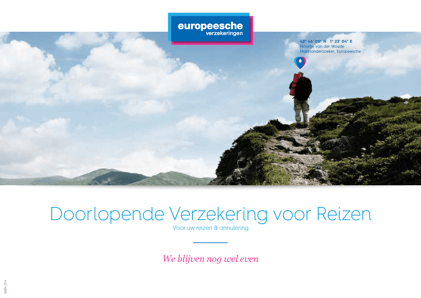
Europeesche verzekeringen
Who dares to break the ‘unwritten convention’ of using portrait PDFs? The marketers at Europeesche (now part of a.s.r.) had their doubts at first as well, but last year they took on the challenge after all. It fitted the revitalisation of the brand, and at the same time they were building a new corporate site. A good moment to improve the way information is provided to (potential) customers and business partners (ATPs, travel partners and authorised agents).
The product information of Europeesche and the terms and conditions for each insurance product are now online, and the enthusiasm is considerable. A nice side effect is that the layout orientation has had a positive influence on the eventual visual language of the new brand presentation. This had not been planned in advance, but along the way it produced part of what makes Europeesche distinctive.
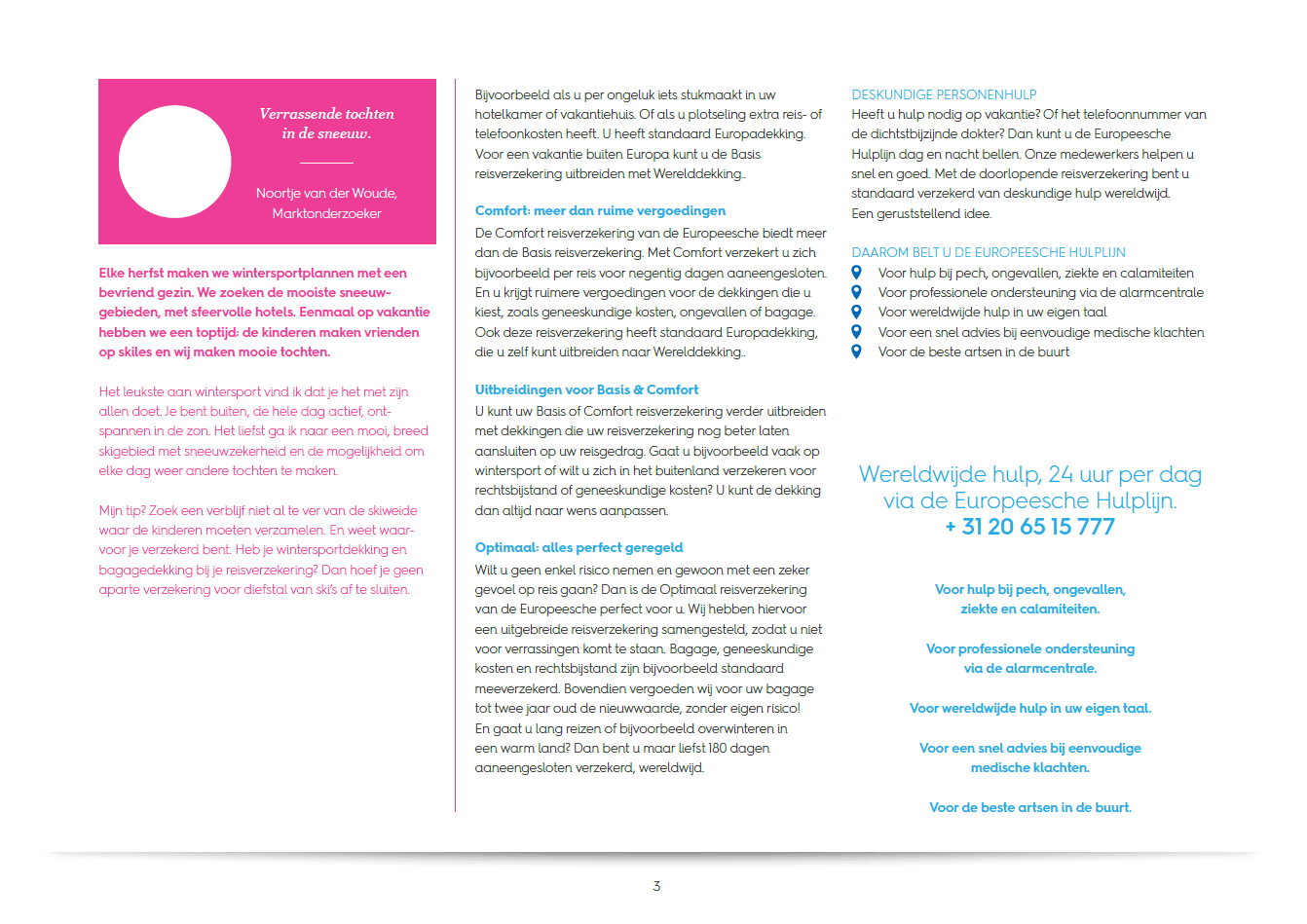
Advantages of a landscape online PDF
Besides better online readability, the choice for the landscape PDF brings Europeesche even more advantages. Because it reads better online, less is printed – and the environment is happy with that. The product information and terms and conditions are hardly printed at all any more, which saves costs, prevents old stock from having to be thrown away and is again more environmentally friendly. The most up-to-date versions are now immediately available, both online (and therefore also to the customer) and throughout the entire channel – in short: optimal time-to-market.
Design tips
Make sure the size or ratio prints well on A4 format. Make sure elements do not run off the page. Or design it in such a way that printing does not leave unwanted imagery behind or cause important elements to drop away. Create navigation aids with hyperlinks – certainly in larger documents. Keep an eye on the file size! For online use 96dpi is sufficient, for print versions 200 dpi is sufficient. Something would have to go badly wrong for you to still end up above 1 MB.
Portrait or landscape, that’s the question
This plea for the landscape online PDF stems from my own experience and observation. And I cannot imagine that I am the only one striving for usability and readability. Who shares my view, or has a useful addition to make? Positions like this need critical assessment and feedback in order to gain broad support. So I would like to invite not only designers and marketers but all readers to give their opinion and leave a response by email. Thanks in advance!